How we designed and launched the Student Beans Apps
A look into the research, design and iteration process of launching our first app.
Company
Student Beans
Role
Lead Product Designer
The Problem
Over 10 years, Studentbeans.com had firmly established itself as the go to website for student money saving, discounts, advice and student jobs. I joined the Student Beans team as a Product Designer to play a role in the development of a more focused product strategy, which was based on a shared vision for Student Beans:
Following this, I was to lead the design of the iOS & Android apps alongside a team consisting of 2 Product designers, a PM & 2 developers.
The whole process took a ton of research, exploration, prototyping and testing. With the initial launch, we ended up with an app that we could proudly say set the foundations for making Student Beans a must have lifestyle app.
Here’s what it took to make it happen.
Gathering User Insights
To really understand our users and how to best develop the product to shift its mental model, we needed to start talking to them.
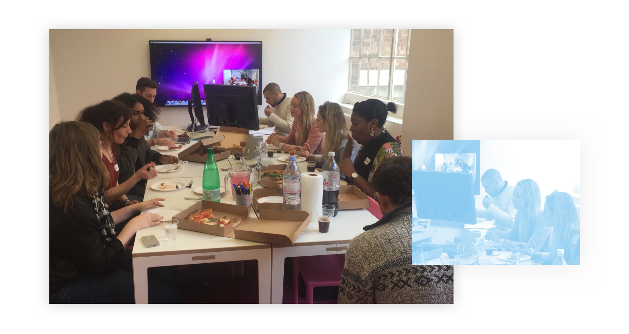
Myself and two colleagues organised and conducted a focus group, involving participants who use Student Beans as well as our competitors. The aim of the focus group was to gather qualitative information on the behavioural traits of our user base when it came to purchasing, and their attitudes, perceptions and current use of Student Beans itself.
This session was absolutely invaluable to setting the path to designing a product that meets our audience’s needs.To help uncover how we could fit into the consumer cycle and understand purchasing habits further, the team and myself conducted guerrilla interviews around local universities and college campuses.
This method of research was our cheapest and by far the most valuable. Our target audience literally gather in buildings that we could just walk into.
The research data was represented visually to help create a clear and easily digestible image of our users. The most useful, while developing the product IA, were the Journey Maps. These provided us with common scenarios and areas of influence outside of the interactions with our site directly; mapping out the journey of our target audience while they shop — highlighting triggers, their feelings throughout, pain-points and areas of satisfaction.
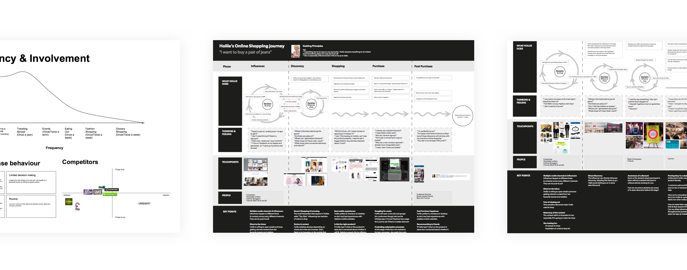
As a brand we wanted to utilize as many touch points as possible to aid the redemption of offers as well as influence purchases. The user research allowed us to uncover behaviours and motivations, providing a support for concepts and feature ideas that addressed the needs of users.
Deciding on a Minimum Viable Product
Of course all of the research had got our brains overly stimulated, ideas began to flow from the team and we found ourselves with a pile of potential features and directions.
To make sure we were building the right thing for our users and reducing risk, it was important that we focused on the sufficient features that would satisfy our early adopters. We focused on what exactly the core functionality of the app should be and the problems it should solve in respect of the user and the business needs. These areas were:
1. Verification of Student Status Students must be able to seamlessly verify themselves as a student while keeping non-students out.
2. Discovery of discounts The app can only succeed if users can find discounts for brands or activities they are interested in.
3. Redemption of discounts Integrity will be lost if users have a bad experience while using our discounts.
As we concentrated on these core features, I used The Action Priority Matrix to plot ideas. By choosing stories intelligently, we could make the most of our time and opportunities
.png)
From our research we found the aesthetics of the app to be very important for our target audience, often identifying themselves with brands and the image they portray. Although the first version of the app would be basic with regards to features, we were conscious to not let the idea of an MVP retract us from making a lovable product — We would not sacrifice quality.
Design & Validation
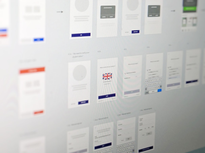
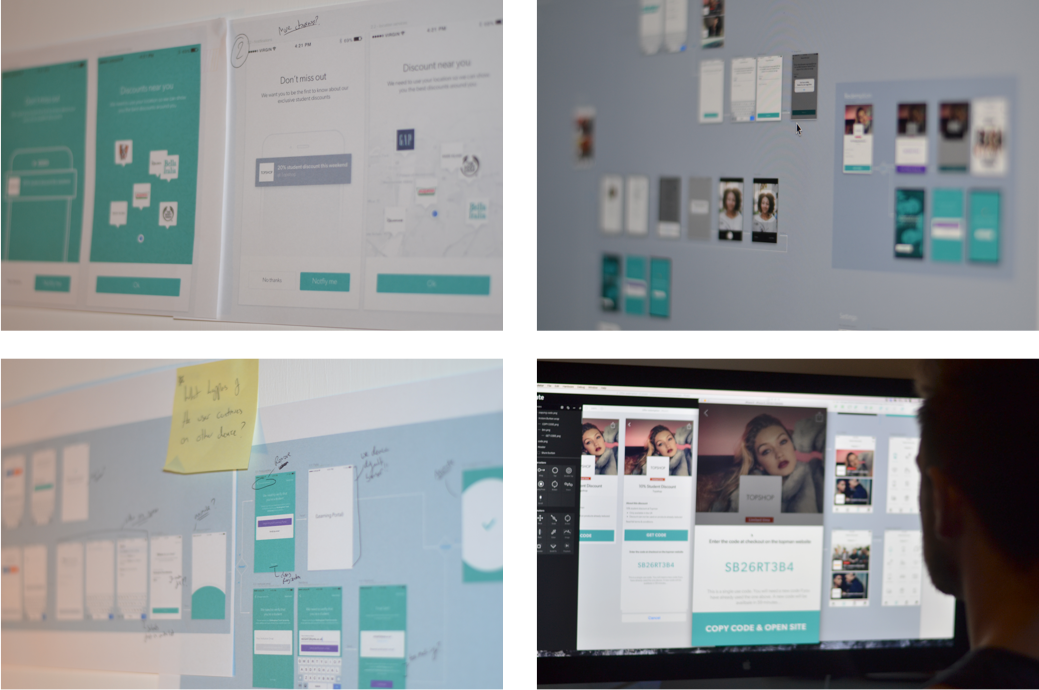
Our aim was always to validate ideas as fast as possible. It didn’t matter if it was roughly drawn wireframes or high fidelity prototypes, I opted for whichever method allowed me to quickly get something into the open and assumptions tested. Sketch App was used to produce the high fidelity screens as we moved forward.
We took full advantage of having a database of our target audience at our fingertips. Putting out adverts in our newsletters and social media pages, we recruited a bunch of students that were willing to help us validate our design decisions.
Prototypes of the app were built in Invision and Principle, dependent on the level of interaction needed.
Clearing For Launch
The last thing we wanted was to see our app disappoint our users. I put together a vigorous QA plan which would scrutinise the app for bugs, usability issues, user perception, efficiency and reliability.
Once we completed our rounds of dogfooding, I sent out an email to our subscribers, to further build on the list of testers we already had. We gave our testers a couple of weeks to stress test the app, providing them with specific actions to complete as well as encouraging them to use the app at their own free will. We used doorbell.io in our beta build to allow frictionless feedback.
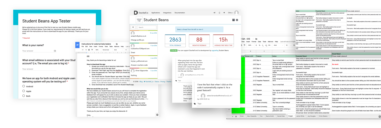
All feedback was captured, explored and prioritised. I still can’t get over how good it felt to have an active community of users using the apps you’ve worked hard on and sharing exactly what they thought; the good and the bad!
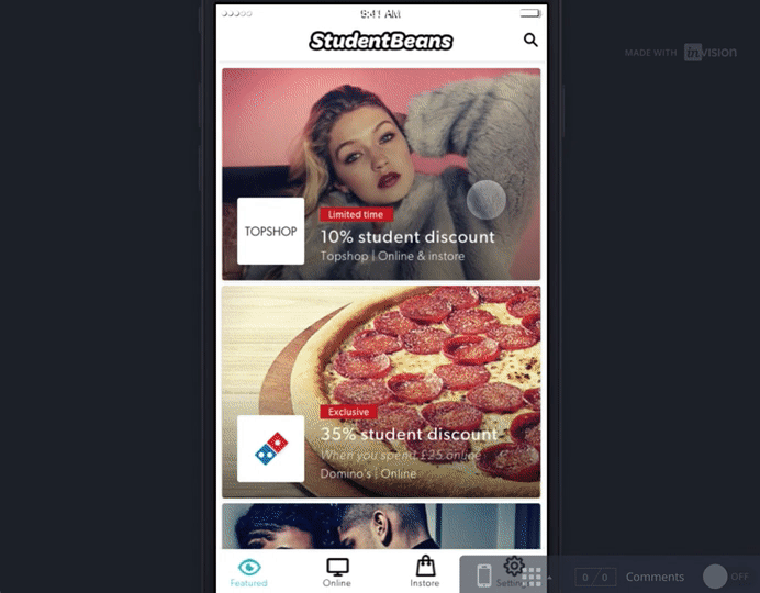
The Live Student Beans App
Launching is never the end; it’s just an absolutely public and terrifying round of testing. We continued our approach to regular testing and iteration after the launch of v1, we could begin refining the app based on the usage in the wild, feeding our ever growing roadmap of features.
With over a million downloads, Student Beans has become the money saving app for students across the globe.
🍎 iOS — https://www.studentbeans.com/uk/student-beans-id-ios-app 🤖 Android — https://www.studentbeans.com/uk/student-beans-id-android-app
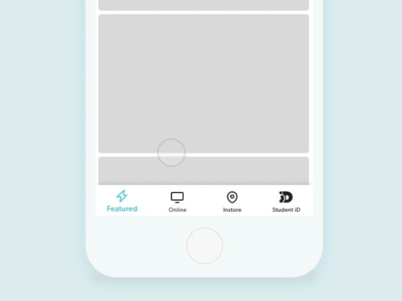
Navigation
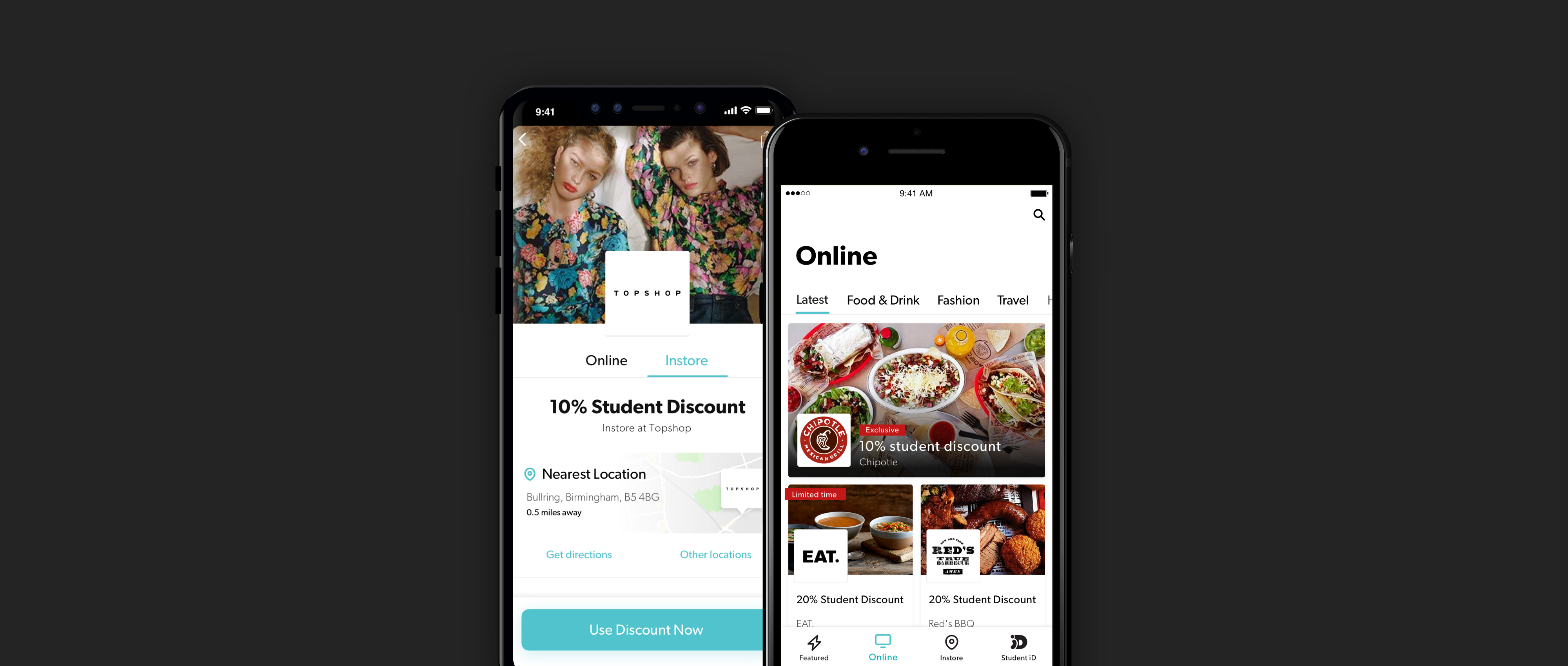
From our research into shopping habits and behaviours, it was clear that there were always two distinct use cases. Shopping online vs Shopping In-store. That distinction had to be clearly delineated in the app’s navigation and our decision to do so has been highly cherished by our users. We also catered for the window shopper and those looking for inspiration, so this type of user can always see a mix of both instore and online discounts from the featured page and the discovery page.
The Student Beans iD card also takes a seat at the forefront to help us instill the idea that physical student cards are redundant and that you can just reach for your SBiD to prove your student status.
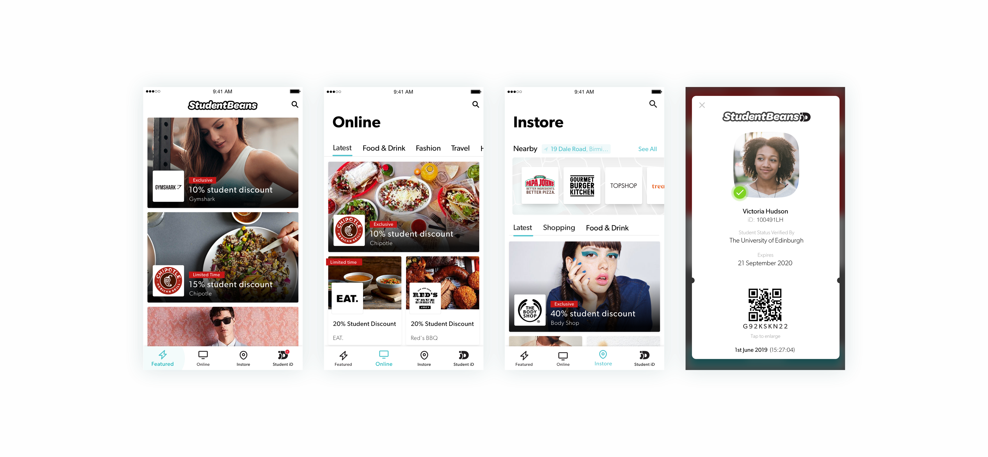
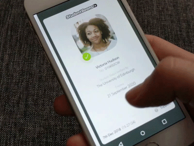
Proof of student status
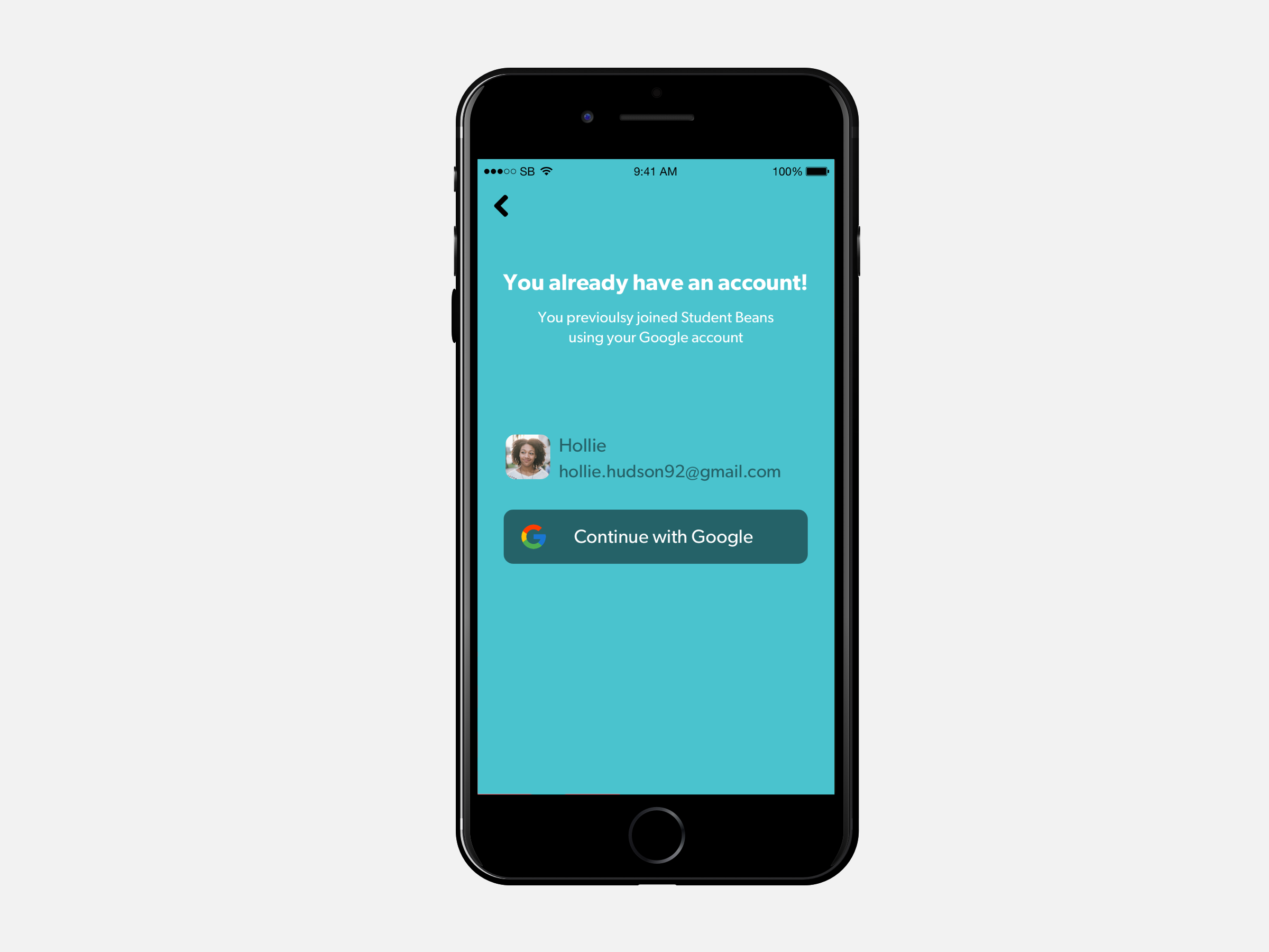
Our partners rely on the fact that we have a student verification system which helps identify an individual as a student — trusting that students and only students will gain access to the discount. A system that does a great job to deny access to those that aren’t students can also create pain points and frustration for actual students.
This was one of the single most iterated features, it was stress tested before release and has been tracked closely ever since. Verification is part of the sign up process, usability and technical issues here can negatively impact ourselves and our partners. Aside from gaining members, the slicker our verification service is the less support enquiries we get, which has historically caused huge workloads.
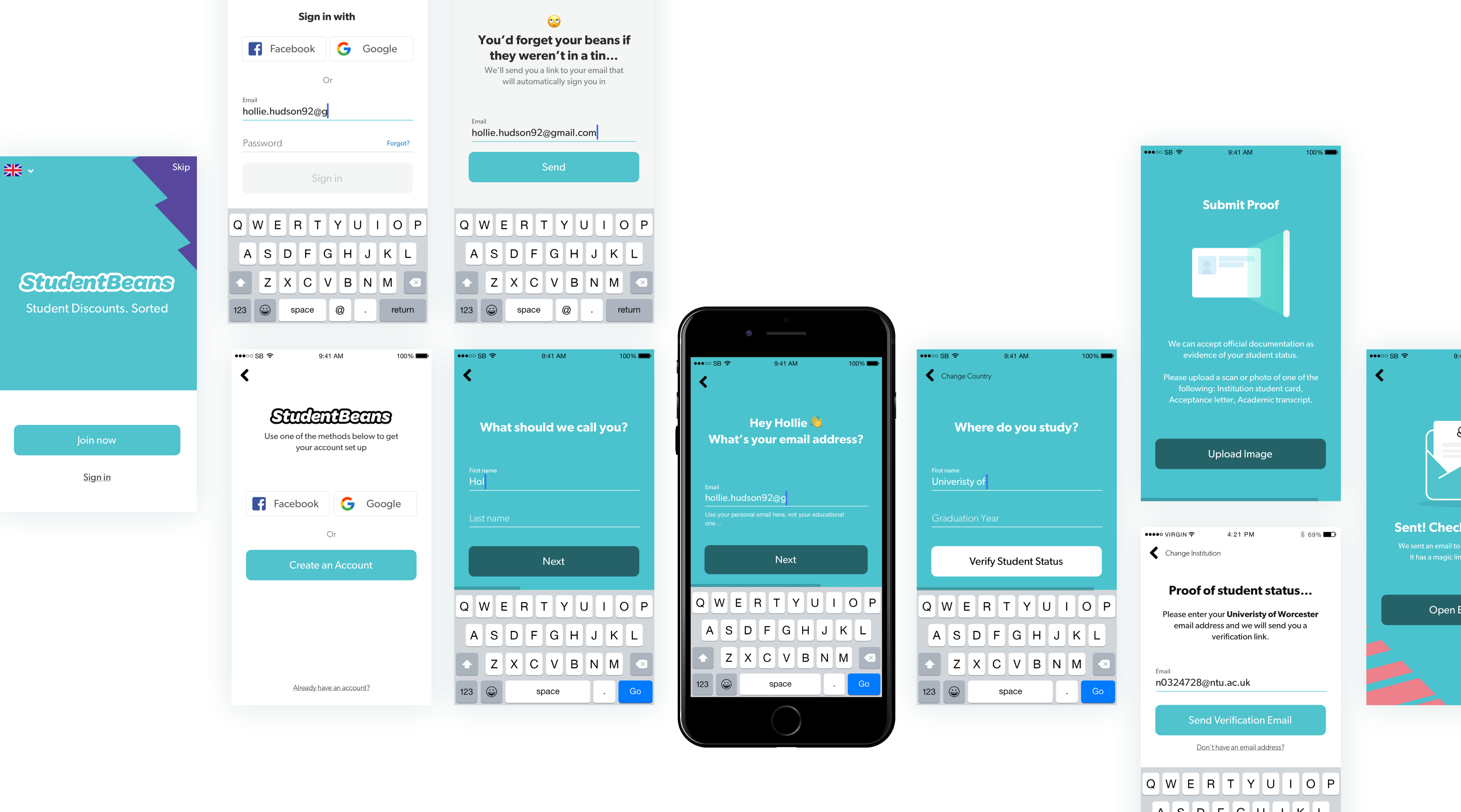
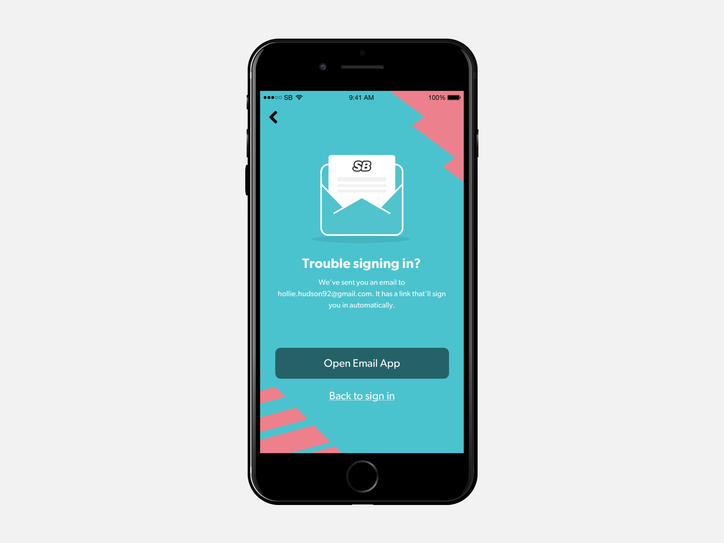
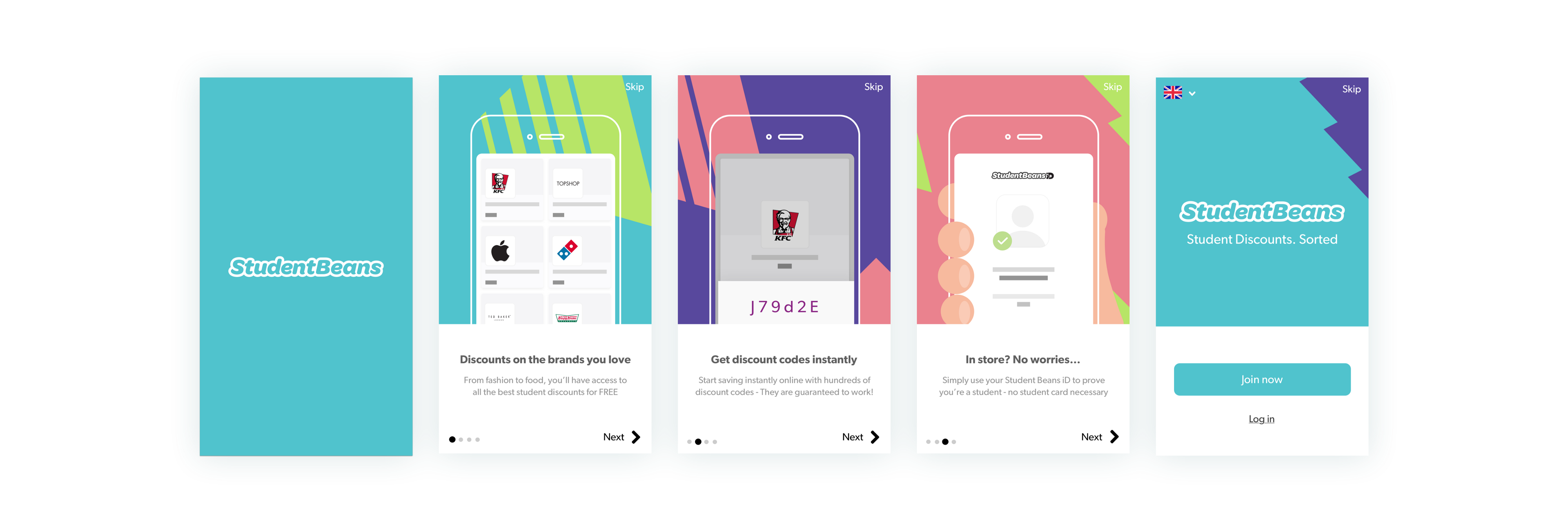
Onboarding & Educating new users
Our onboarding aims to educate and retain users. The app becomes more valuable the more of the user account has been completed and discounts have been redeemed. For this to happen the user must be convinced by the benefits enough to sign up, have surfaced discounts of interest and go through the trouble of completing their Student iD.
Introducing welcome screens to our app highlighting the key benefits of joining saw a 260% increase in registration from first time downloaders. We’ve accomplished this by keeping the screens short and focused on the core benefits rather than features.
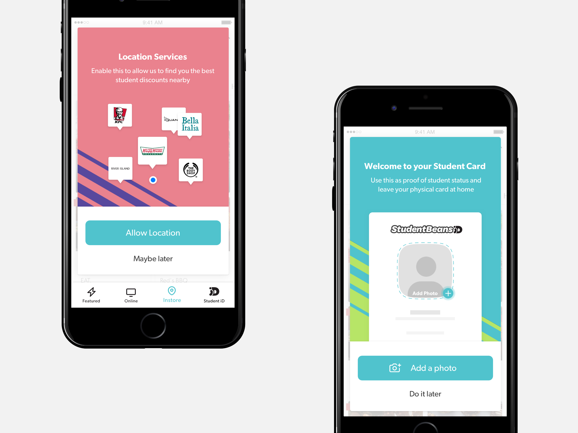
We found that users that had completed verification, enabled location services, and had added a photo to their iD were 316% more likely to redeem a discount again. We further encourage these actions contextually, which is a much more engaging way to show the value of the app.
Confidence in redemption
Unlike many other voucher sites, all our discounts are with retailers and restaurants that we explicitly partner with. We know that our discounts will be accepted at the venues we say they will, but this doesn’t mean our users have the same confidence. Anxiety around asking if a store does a discount, or knowing when to present their voucher, was a major pain point that came to light out of our user research.
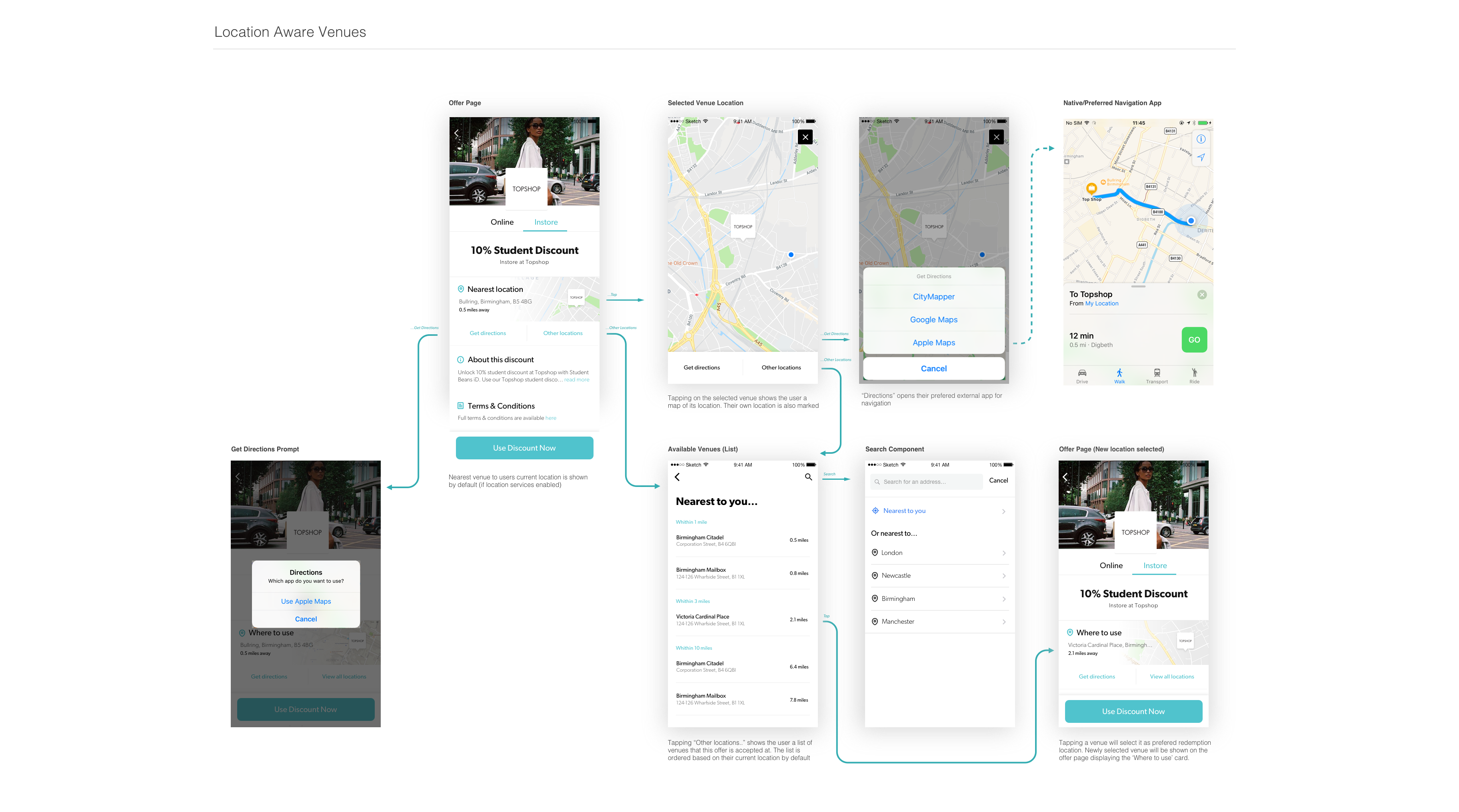
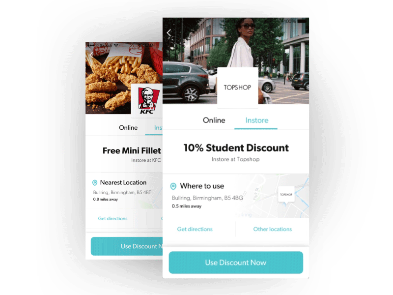
The major feature that has helped bring confidence to the redemption has been the the addition of the participating venues module. All offers allow the user to see exactly where their nearest participating store is, as well as being able to check any other venue in the country.
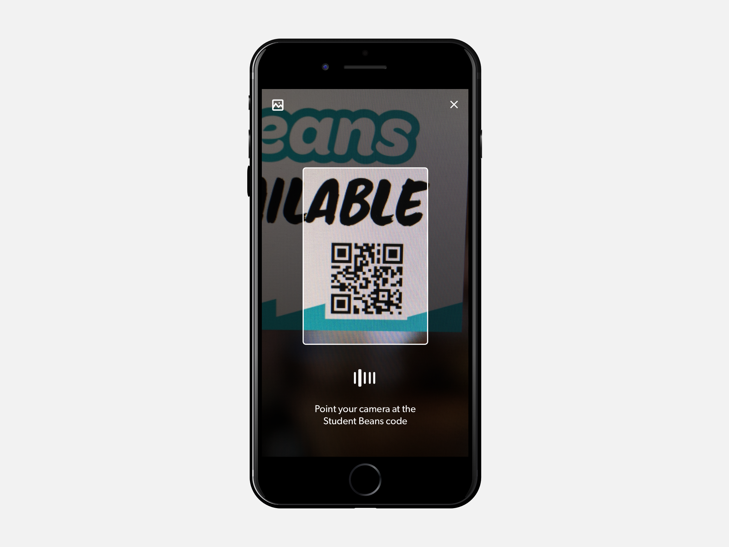
We’ve refined our offer pages to be as simple and to the point as possible, giving clear instructions to what the offer is and how to redeem it. Leaving as little room for confusion as possible. With thanks to our account management and marketing team, we were also able to get physical assets to the participating stores which left no doubt in users minds that the discount would be accepted. The window stickers, strut cards and flyers also included a Student Beans QR code. This code can be scanned from within the search pages of the Student Beans app, providing a fast and convenient way for existing users to get the discount for that particular store.
What's Next?
Of course this isn’t where it ends. There is still lot’s of work for us to do to improve both the product itself and it’s offerings, the visuals you see above will be out of date in no time. We’ll continue our approach to constant learning and iteration. Additional features are already in the works and I’m excited to see how it develops further.
As the Apps team here at Student Beans triples in size, I’m going to continue to work on formalising a design system with the engineering team, building reusable components and defining the visual style further. This will allow us to quickly iterate, speed up dev time, and maintain design consistency as the design team grows further.
Thanks for reading! 🙏